

Designing the Book of Psalms: A Memoir
by Joseph Kapelyan
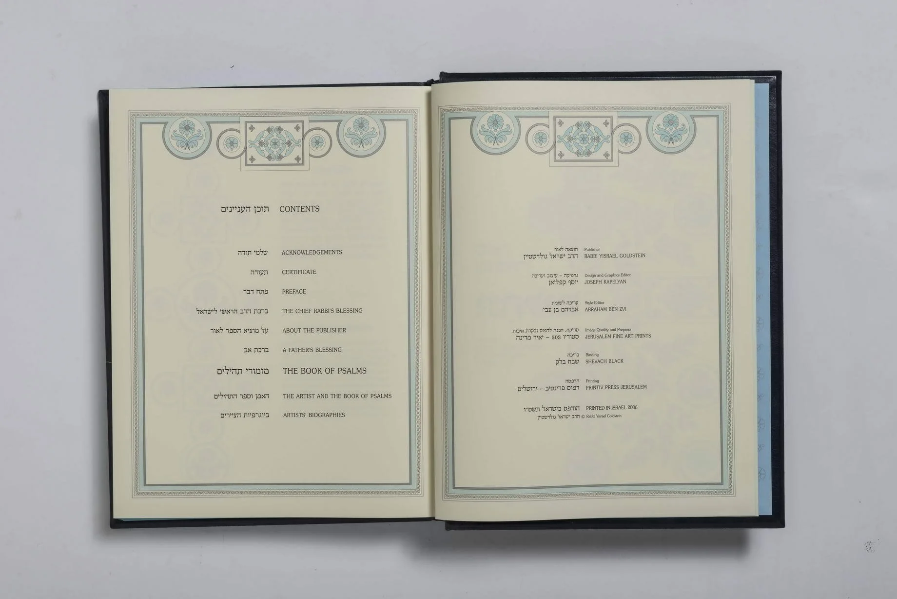
ספר מזמורי תהילים
The book of Psalms : illustrated by 150 Israeli artists and accompanied by a new English translation / chief editor and publisher, Rabbi Yisrael Goldstein artistic consultation, Prof. M. L. Mendelson, Dr. Ruth Dorot
design and graphics editor, Joseph Kapelyan.
The Book of Psalms edition is extraordinary not only because it is a costly and exclusive volume boasting superb, near-facsimile print quality and a large format, but also because it serves simultaneously as the Book of Psalms and a fine art album featuring the works and biographies of 150 Israeli artists. It is perhaps the only publication of its kind where Judaic religious text and the visual arts are seamlessly fused into one unified whole, which is precisely what makes it unique. Since the book was published not only in Hebrew but also in English, and given that the Psalms of David are also used within the Christian tradition, the scope of this edition expands tremendously. Consequently, this book carries Israeli culture and art far beyond the nation's borders.
I first met Rabbi Yisrael Goldstein in the year 2000 at the studio of the artist Eduard Levin. Levin showed him my monograph and suggested that he invite me to design the Book of Psalms, which Goldstein had conceived to publish around that time. He liked my book and proposed that I become the designer and art editor of the edition. The project was envisioned as a luxury, large-format exclusive volume, featuring a color illustration for every single psalm, bound in embossed genuine leather.
Rabbi Goldstein personally sought out the masters and commissioned them to create an illustration for one of the psalms. Thus, one hundred and fifty different authors created one hundred and fifty illustrations—corresponding to the number of psalms in the book—utilizing a wide array of techniques and styles. The book was slated for publication in two languages: Hebrew and English. I began working on the design, while Rabbi Yisrael Goldstein undertook numerous trips abroad to secure potential subscribers and sponsors for this high-value production.
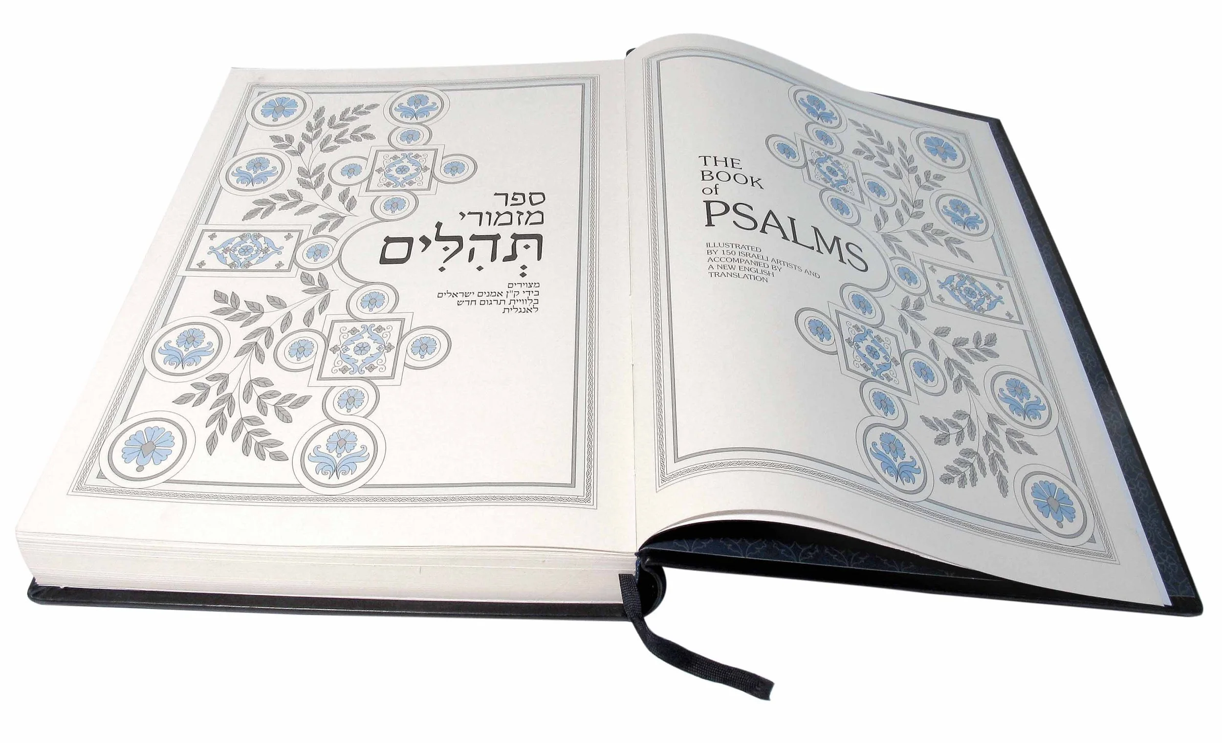
I studied similar historical publications in the rare books department at the Tel Aviv University library. For this book, I selected a 44 × 34 cm format, a decorative floral-ornamental style, and an embossed cover made of genuine sheepskin leather imported from Italy. Because the Hebrew text was paramount, the entire book opened from left to right, just like any Hebrew volume. Each new psalm opened onto a fresh spread, where the illustration sat on the right-hand (even) page, and the text sat on the left.
The core difficulty of working on the book lay in the fact that every psalm had to begin on a brand-new page spread, yet the lengths of the psalms vary drastically—some consist of literally four lines, while others span four entire pages. Furthermore, the text on each page ran in two languages—Hebrew at the top with English underneath—and the content on a single page had to match perfectly in both languages. The precise typesetting and structural placement of the text constituted the primary challenge of this edition.
It was during this process that I came up with my own minor breakthrough: I introduced what I called a "dynamic grid." First, I set the Hebrew typeface to a large, uniform size across the entire book, whereas the size of the English font was adjusted based on technical necessity. In addition, I implemented three distinct margin increments from the right edge of the page (the less text there was, the wider the margin). For large blocks of English text, I introduced a two-column layout, since long lines of small print are much easier to read when broken into shorter measures.
In the space between the Hebrew and English texts, I integrated a decorative graphic element that could expand or contract to fill the area—ranging from a mere pair of leaves to a full branch—in order to balance and occupy the negative space between the languages. Since each psalm has a sequential number (expressed as letters in Hebrew and as numerals in English), I transformed these characters into illustrated drop caps highlighted in color to ornament the textual pages. The entire graphic layout was restricted to a three-color palette: white (the paper), black with shades of gray, and a delicate light blue.
I developed several design options, from which one final layout was permanently selected, and I set to work on the original mechanicals and dummy layout for the entire book. First, the complete Hebrew text was typeset on a computer; I manually pasted it into the layout grid and then custom-fit the size of the corresponding English text block by block.
Next came the stage of digitizing the illustrations by scanning the original artworks. This phase initially took place at an Jerusalem printing house, but due to unsatisfactory results, Rabbi Goldstein transferred the process to another firm—Jerusalem Fine Art Prints, managed by Yair Medina. There, a meticulous, high-quality scanning of the originals was executed, producing "iris prints"—facsimile digital proofs that were carefully cross-referenced with the original artworks and adjusted repeatedly.
The printing of the book finally took place in 2007 at Printiv, one of the finest printing houses in Jerusalem. A slightly toned, off-white paper stock was specially chosen for the run. Yair Medina and I were personally present during the printing of the entire book, color-correcting the sheets directly alongside the pressman. A limited run of 613 numbered copies was printed (corresponding to the number of mitzvot or commandments in Judaism), plus an additional 150 copies designated for the participating artists. Every artist signed their respective illustration in pencil across all copies. The volume spans 432 pages; following the psalms, the edition includes an art-historical essay by Bar-Ilan University Professor Marcel Mendelson, as well as brief biographies of all 150 artists. All copies are numbered and bound in embossed leather. A custom decorative cardboard slipcase was also manufactured for the book.
With that, my work as the designer and art editor of the volume came to a close.
P. S.
The original illustrations were showcased at exhibitions in the library of Bar-Ilan University in 2003 and at the Hanita Kibbutz Museum in 2007. In 2008, the book was exhibited at the international Art Jerusalem Fair 08 in Jerusalem. That same year, I sent my personal copy of the book to St. Petersburg for the IV International Biennale of Graphic Art dedicated to the Book, where our edition was awarded a Diploma.
Как я работал над книгой "Псалмы"
Иосиф Капелян
Издание «Псалмы» особенное не только потому, что оно дорогое и эксклюзивное, с отличной, почти факсимильной печатью и большого формата, но и потому, что это одновременно и Книга Псалмов, и художественный альбом, где представлены работы 150 израильских художников с их биографиями. Пожалуй, это единственное в своём роде издание, в котором иудаистский религиозный текст и изобразительное искусство слиты воедино, и в этом его уникальность. Так как книга выпущена не только на иврите, но и на английском языке, а Псалмы Давида используются также и в христианской традиции, границы этого издания невероятно расширяются. Таким образом, эта книга несёт за рубеж израильскую культуру и искусство.
С раввином Исраэлем Гольдштейном я познакомился в 2000 году в мастерской художника Эдуарда Левина. Левин показал ему мою монографию и посоветовал пригласить меня оформлять книгу «Псалмы», которую к этому времени задумал издавать Гольдштейн. Книга моя ему понравилась, и он предложил мне стать оформителем и художественным редактором этого издания. Проект задумывался как дорогой и эксклюзивный, большого формата, с цветной иллюстрацией к каждому псалму, в кожаном тиснёном переплёте.
Раввин Гольдштейн сам подыскивал мастеров и поручал им делать иллюстрацию к одному из псалмов. Таким образом, сто пятьдесят разных авторов создали сто пятьдесят иллюстраций — по числу псалмов в книге, в самых разных техниках и стилях. Издание предполагалось на двух языках: иврите и английском. И я начал работать над оформлением, а раввин Исраэль Гольдштейн предпринимал многочисленные поездки за границу для поиска потенциальных подписчиков и спонсоров этого дорогого издания.
Я изучал подобные издания в отделе старинных книг в библиотеке Тель-Авивского университета. Для этой книги я выбрал формат 44 × 34 см, декоративный растительно-орнаментальный стиль и тиснёную обложку из натуральной овечьей кожи, привезённой из Италии. Так как главным был текст на иврите, вся книга открывалась как любое издание на иврите — слева направо. Каждый новый псалом открывался новым разворотом, где на правой чётной странице располагалась иллюстрация, а слева — текст.
Вся трудность работы над книгой заключалась в том, что каждый псалом должен был начинаться с нового разворота, а размеры псалмов совершенно различны: есть состоящие буквально из четырёх строк, а есть на четыре страницы. Кроме того, текст на каждой странице шёл на двух языках — иврит сверху, а под ним английский, — и содержание текста на одной странице должно было строго совпадать на обоих языках. В точной вёрстке и размещении текста и состояла вся сложность этого издания.
И вот я придумал своё маленькое открытие — ввёл так называемую «движущуюся сетку». Во-первых, шрифт на иврите я сделал крупным и одного размера по всей книге, а размер шрифта на английском языке менялся по надобности. Дополнительно к этому я ввёл три размера отступа от правого края страницы (чем меньше текста, тем больше отступ). Также для большого количества текста на английском языке я ввёл две колонки, так как длинная строчка мелкого шрифта легче читается, когда она короче.
В промежутке между ивритским и английским текстами я поместил декоративный элемент, который мог занимать больше или меньше места (от пары листочков до целой веточки), чтобы уравновешивать и заполнять свободное пространство между текстами. Так как каждый псалом имеет порядковый номер (в иврите это буквенное выражение, а в английском — цифра), для украшения текстовой страницы я сделал из них буквицы и выделил цветом. Всё графическое оформление было решено в три цвета: белый (бумага), чёрный с оттенками серого и нежный светло-голубой.
Я подготовил несколько вариантов оформления, из них был окончательно выбран один, и я начал работать над оригиналом оформления и макетом всей книги. Сначала на компьютере был набран весь текст на иврите, я выклеил его в макете, а затем индивидуально подбирал размер английского текста.
Затем следовал этап ввода иллюстраций в компьютер через сканирование оригиналов. Сначала этот этап проходил в одной из иерусалимских типографий, но из-за неудовлетворительных результатов раввин Гольдштейн передал процесс другой фирме — Jerusalem Fine Art Prints, которой руководит Яир Медина. Там было выполнено тщательное и качественное сканирование оригиналов и получены «айрисы» — факсимильные пробные компьютерные отпечатки, которые детально сверялись с оригиналами и снова корректировались.
Печатали книгу только в 2007 году в одной из лучших типографий Иерусалима — Printiv. Для печати была подобрана бумага не чисто белая, а немного тонированная. Я и Яир Медина лично присутствовали при печатании всей книги и корректировали цвета вместе с печатником. Было отпечатано 613 номерных экземпляров (по числу заповедей-мицвот в иудаизме) плюс 150 экземпляров для художников. Каждый художник подписал карандашом свою иллюстрацию на всех экземплярах. Объём книги составил 432 страницы. После псалмов в издании размещена искусствоведческая статья профессора Университета Бар-Илан Марселя Мендельсона, а также краткие биографии всех 150 художников. Все экземпляры нумерованные, в кожаном тиснёном переплёте. Для книги был изготовлен специальный картонный декоративный футляр.
На этом моя работа дизайнера и художественного редактора книги была закончена.
P. S.
Оригиналы иллюстраций экспонировались на выставках в библиотеке Университета Бар-Илан в 2003 году и в музее кибуца Ханита в 2007 году. В 2008 году книга выставлялась на международной выставке Art Jerusalem Fair 08 в Иерусалиме. В этом же году я послал свой экземпляр книги в Санкт-Петербург на IV Международную биеннале графики, посвящённую книге, и наше издание получило Диплом.
